
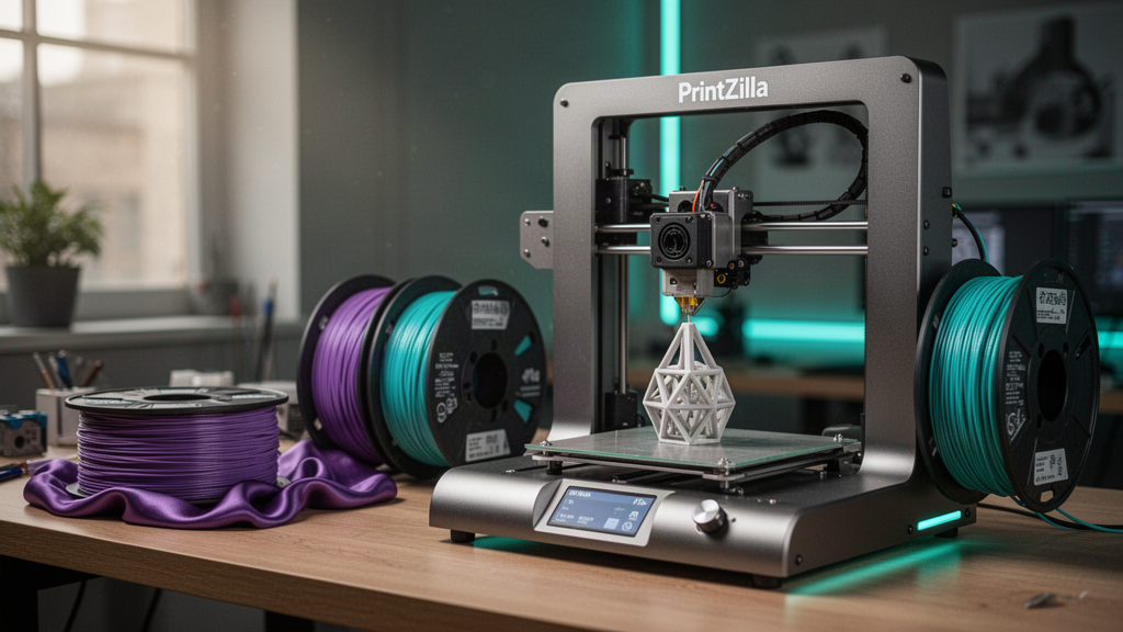
What you need to know.
From the perfect font to a stand that actually works: build personalised 3D lettering that looks deliberate, prints cleanly and survives being handled.
- Start with the recipient's exact spelling, target dimensions and a readable font with suitable usage rights.
- Thin strokes and disconnected letters often need reinforcement, a shared backing plate or a different printable orientation.
- Layer height, colour contrast, seams and lighting affect the final appearance, but a finer layer alone does not fix poor letter geometry.
- For physical orders, approve the rendered design, material, size, price and delivery separately from any virtual LIVE reveal.
What makes a personalised 3D printed name sign look professional?
A clear name, well-balanced typography, deliberate depth and stable geometry matter more than unnecessary effects.
A name sign becomes memorable when the lettering has an attractive silhouette that looks good in ordinary daylight, not only under studio lighting. A large readable word, controlled spacing and a colour combination with real contrast can be far more polished than a complicated design with tiny floating details. Consider where the sign will live: on a desk, bedroom shelf, gaming setup, shop display or behind a livestream camera.
This tutorial describes a practical design workflow, not a promise that every proposed name will fit a particular printer or be available as a stocked PrintZilla product. A short name in a sturdy block face is relatively straightforward. A long phrase in delicate handwritten script may need a supporting base, revised letter connections or separate manufactured pieces.
| Design question | Good decision | Why it matters |
|---|---|---|
| How wide? | Agree a physical size first | Readable detail and print-bed fit |
| Where displayed? | Desktop stand or suitable mount | Stability and real usage |
| Which font? | Readable, printable and licensed | Fine strokes and commercial permissions |
| How many colours? | Simple deliberate palette | Contrast, cost and manufacturing method |
| What finish? | Test with real filament | Metallic effect is not actual metal |
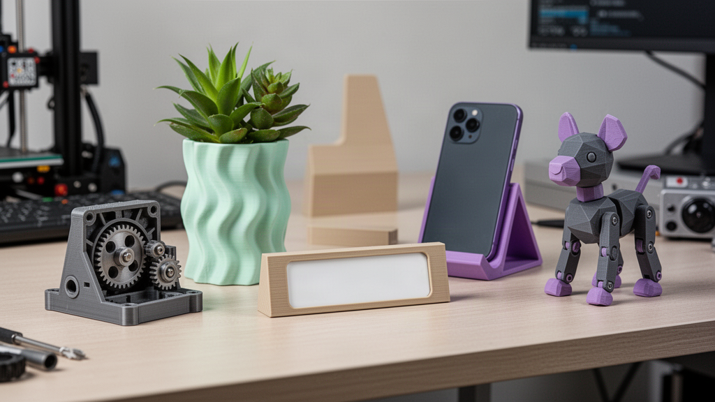
How do you choose a font that actually prints well?
Typography is geometry once a word becomes a three-dimensional object. Extremely narrow strokes, long unsupported flourishes and separate dots on letters may exceed what a given nozzle can reproduce reliably. The real limiting detail is not only the vertical layer height: nozzle diameter, intended line width, font outline and physical sign size all matter. A bold sans-serif, chunky serif or carefully connected script is often a useful starting point.
Preview a word in the proposed font at its final physical size, not only at a large zoom level. Check the holes inside letters such as A, B, P and R, the dot above an i, and narrow joins that may disappear in the slice. The longer the name, the more difficult it becomes to keep character height and detail consistent within a fixed overall width. Do not scale down until small features vanish.
Commercial font rights matter when producing and selling physical signage. Some open-source fonts allow commercial use, but check the particular font licence rather than making assumptions from a free download. Google Fonts publishes a selection of openly licensed fonts; individual licence notices and attribution requirements should still be reviewed.
Should the letters be connected or mounted on a backing plate?
Disconnected lettering looks beautiful in an illustration, but individual letters cannot float together as one physical sign without some kind of support. A shared plaque, base bar, bridge between letters or separate mounting layout provides a practical solution. Consider whether each part is intended to be placed on a flat surface, fixed to a wall or assembled into a freestanding piece.
A backing plate can strengthen thin letterforms and simplify handling. A separate colour layer can help lettering stand out, although it adds manufacturing considerations. For script faces, connect adjoining strokes deliberately and inspect every junction. A fragile dot or comma may need extra thickness or a separate attached component. Decorative wall signs also need an appropriate mounting method, not an untested printed hook assumed to carry any weight.
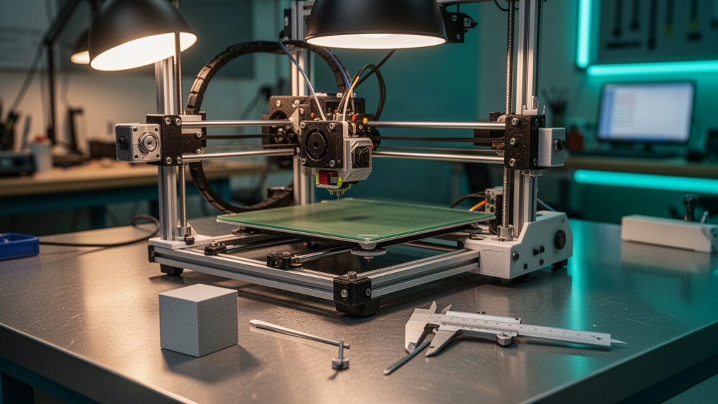
What size and letter depth should a name sign be?
Choose the placement and viewing distance first. A desk name sign that sits a metre away should have enough height for comfortable reading, while a small key tag has different constraints. Measure the available shelf width and the printer's actual build area. If a name is too long to fit at legible scale, consider stacking words, changing the typeface, designing a two-part assembly or proposing a larger product.
Depth creates the sculptural effect, but more depth also increases material and may affect tipping or orientation. A tall freestanding nameplate needs a wide enough foot or engineered stand, and the backing plate must support the whole silhouette. Model realistic edge radii and avoid sharp corners where someone may handle the gift. Rather than prescribing one millimetre measurement for every name, use an actual sample and assess fit, strength and surface finish.
| Use case | Most important fit check | Design consideration |
|---|---|---|
| Desk nameplate | Stable base on real surface | Viewing angle and centre of mass |
| Shelf display | Clear available height and width | Readable lettering and dust cleaning |
| Wall decoration | Actual mounting location | Suitable approved fasteners |
| Livestream prop | Legible from a camera distance | Reflections and camera crop |
| Mini gift tag | Attachment opening | Material strength and small-part safety |
Which colours and filament finishes look the most premium?
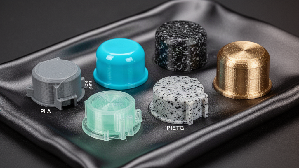
Aim for strong contrast without making every letter a different colour. For example, bright text on a deep matte backing can read clearly, while similar shades with different gloss levels may disappear under some lighting. Metallic-effect and silk filaments can give decorative highlights, but they are still plastic. The real surface will depend on extrusion, lighting, material formulation and post-processing rather than a perfect screen render.
Different colour effects may require physical filament swaps, a compatible multi-material printer or separate printed components. A one-click colour selector in a virtual tool does not imply the same options are available on the real equipment. Verify colour availability and the intended manufacturing method in the quote. Consider how shiny materials reveal seams or layer marks and where the customer will place the sign.
How should you slice and orient a personalised name sign?
The printed orientation affects edge smoothness, raised letter detail, support scars and how easily the object stays on the bed. Flat-backed name signs are often straightforward to lay on a build plate, while unusually tall freestanding shapes may need a different orientation or an integrated base. Inspect the sliced preview to make sure every thin stroke becomes a real extrusion path rather than silently disappearing.
A finer layer height may soften vertical stepping around curves but will not rescue strokes narrower than a printable extrusion or an unsupported floating letter. Correct wall count, first-layer adhesion, calibrated flow and sensible speed matter. For a multi-colour effect, confirm where material switches occur and whether the printer supports them. A good test is to slice the longest name you plan to accept and inspect every letter at the final intended size.
Text orientation can also influence mechanical strength. A long, thin freestanding character that takes repeated knocks may crack across layers despite looking perfect from the front. If a delicate flourish requires significant supports, redesigning that flourish may produce a better result than increasing support density and post-processing time.
How do you make a personalised name reveal look brilliant on TikTok LIVE?
A compelling short-form reveal starts with the customer's chosen name displayed clearly, then shows purposeful design stages instead of random camera movement. Frame the printer or virtual model so the lettering is not hidden behind controls. Choose one or two camera moves that reveal depth and finish; keep the graphic interface uncluttered and readable on a small portrait screen. Respect the requester's preference about whether their real name should be shown publicly.
If the stream shows a simulated print, mark it as virtual and do not announce a physical item as finished. For real products, use distinct stages such as request submitted, design approved, production started, completed and dispatch confirmed. A polished experience is more trustworthy when it clearly separates entertainment from the real order ledger.
The complete name-sign checklist before an actual order
- Confirm the exact spelling, accents, punctuation and capitalisation.
- Agree the recipient's preferred font style and verify commercial font permissions.
- Choose legible dimensions based on the real display position.
- Inspect every letter connection, dot, hole and thin stroke in the model.
- Approve backing plate, stand or safe mounting method.
- Agree the actual material, colour availability and surface finish.
- Slice and test representative geometry with a compatible machine.
- Confirm price, lead time, production status and shipping privately.
Save an approved proof so there is no argument about the spelling or finish later. Clear terms also matter because personalised goods may have different change-of-mind cancellation rights under UK law, while faulty or misdescribed items remain protected. A virtual reveal is useful for design approval, but it cannot replace real manufacturing inspection.
Frequently asked questions
01Which fonts are best for 3D printed names?
Bold, legible typefaces or connected scripts with sufficiently thick strokes are useful starting points. Confirm the actual font's licence and test the final physical size.
02Can I print disconnected letters as one solid sign?
Not without an appropriate structure. Use a shared backing plate, bridging geometry, separate physical mounting or another reviewed support method.
03Does a smaller layer height always improve a name sign?
No. Layer height controls vertical stepping, while nozzle size, line width and physical font geometry limit fine strokes and letter details.
04Does a TikTok LIVE name animation mean the item has been manufactured?
No. A virtual preview and a real physical order must remain clearly separate, with manufacturing and delivery confirmed independently.
Sources and useful references
We link to official documentation and publisher guidance where useful. Advice and platform features can change; verify current details with the original source, your printer maker and relevant service provider.
Design a sign someone will actually want to display
Explore personalised name requests and reviewed product options, with the virtual experience separate from a physical production order.
Explore the Live Name Forge